When you sit down with a graphic designer for the first time, there’s a good chance one of the first things he or she will ask you is what color palette you envision. It seems so simple yet picking a color for your logo is undoubtedly one of the most complicated parts of the process. Color impacts a user’s view of your brand in a split-second, and we all know that’s vital when your product labels and packaging need to command attention on a shelf or in the App Store next to dozens of your competitors. We’re here to help you decide which logo colors are best for telling your unique brand story, and which shades will help you stand out.
Why Color Matters
First things first: Why does this all matter? The fact is that research shows again and again that color correlates closely with emotion. One color might convey authenticity and sincerity, while another might signal that you’re “putting it on.” A light blue may convey trust and calm, while a sunny yellow might amp you up. It may seem like a whole bunch of malarkey, akin to astrology or tarot cards, but branding is one of the few areas where color psychology actually appears to be truly effective. Below, we’ll talk about some of the research available suggesting how certain colors trigger certain feelings.
Of course, color is one of the first things a consumer notices about your brand, and that first impression is perhaps the most valuable. In fact, according to Impact of Color on Marketing, a report from researchers at the University of Winnipeg, people make up their minds within 90 seconds of their first interaction with people and products. And, to sweeten the deal in the color department, between 62 and 90 percent of those assessments are based on color alone, according to the report. So, when a consumer picks your product out in a crowd, there’s a good chance it’s because they jive with your chosen color palette.
Conveying the Right Emotion with Color
There is a substantial body of research available to support that certain colors can color the way people view your brand. But there is one (pretty big) caveat. The primary hiccup with color theory in general is that color is, we think, subjective. One person’s experiences, biases and outlook on life might cause them to interpret one color differently than someone else. With that being said, there are certainly a few overarching themes that research can quantify. Here are a few key takeaways, guided by the results from Exciting Red and Competent Blue, a 2012 study by researchers published in the Journal of Academy of Marketing Science.
- Red: Exciting—In the study, researchers found that subjects who viewed red logos perceived the brand to be exciting. No surprise there, since some of the biggest brand rule-breakers command attention in red.
- Brown: Rugged, Earthy—On the other hand, brown signified that a company had a more rugged feel. That’s definitely the feel we get from some famous brown logos, like UPS and Cracker Barrel.
- Blue: Sincere, Competent—Blue has always had a connection with sincerity and competence. In fact, it’s the reason why many doctors and nurses wear blue scrubs. Researchers found that blue feels even more sincere when it’s paired with pink or white.
- Black: Sophisticated—The study found that respondents connected black logos with sophistication. On the other hand, orange logos negatively affected a user’s perception of what’s sophisticated.
- Orange: Exciting—Unsurprisingly, red’s fiery sibling was viewed by respondents also as exciting. That’s probably why you often see the shade used on many soda bottle labels!
- Green: Well-Liked—Green is one of those colors that elicits positive responses across the board. Users view it as sincere and rugged and have a slightly positive association with it in terms of excitement and sophistication.
Quick Tips for Picking a Palette
So now that we know there’s probably some truth to the fact that the color of your logo could correlate with its success, let’s look at some of the best ways to interpret these results to design a standout logo that commands attention and conveys exactly what you want it to.
- Know Your Audience: Obviously, the very first step in your logo design journey should be to identify your target audience and pick colors and themes that cater to it.
- Keep it Simple: While some logos have success when they incorporate many shades on the spectrum (we’re looking at you Google), it’s often best to stick with one or two colors. And, of course, there’s no shame in a monochrome mark…it worked for Apple!
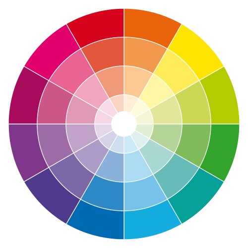
- Consider Color Theory: Go ahead, bust out that color wheel from grade school art class! This will help you determine which colors look best together.
- Think About Saturation: It’s not all about tone. The saturation—otherwise known as the color’s intensity and contrast—also contributes to the message an image sends. For example, low saturation purple may be viewed as sophisticated, and a high saturation red may be viewed as more rugged.
- Think Outside the Box: Because of their connection with sincerity, excitement and competence, blue and red are the most popular logo colors. Want to stand out? Don’t take this well-traveled route.
- Follow Rules (Sometimes): Still stumped? Consider using the 60-30-10 rule, which says that you should use 60 percent of one color, 30 percent of a secondary color and 10 percent of an accent color.
When in Doubt: Test, Survey, Repeat
Of course, the best way to gather insight about any decision you make is to survey your target users. We’d also recommend talking with your graphic designer and giving him or her some creative license. After all, your designer is a professional and has a solid understanding of what will work and what won’t. You can and should request to see your mockup in a few different palettes to see what looks best. Float the different designs to a test market—or your co-workers if you’re lacking in funds—for honest feedback. Finally, iterate as needed!
Kurt started Blanco in 1996 after working in the label industry for more than 10 years. As a Salesman, Sales Manager, then Vice President of Sales for Southern Atlantic Label in Chesapeake, VA he gained a strong knowledge of the label and printing industry. Following Southern Atlantic , Kurt was Vice President of Sales at Custom Printed Products in Shreveport Louisiana. Kurt has experience with most every known Pressure Sensitive Label application, and is very involved in Production and Marketing at Blanco.
Kurt’s wife, Alice, works alongside him at Blanco. They have 3 adult sons and a couple of pups and a cat. Kurt is an avid outdoorsman, he enjoys Hunting, Fishing and Hiking


